9 Best After Effects Plugins for Kinetic Typography and Animated Typefaces (2026)
Kinetic typography is one of those disciplines where After Effects’ native text animator gets you maybe 40% of the way there before the gap between what you’re imagining and what you can build starts costing hours. The right plugins close that gap, whether you’re after a fully pre-animated typeface with built-in motion, a script that automates staggered word layouts, or a tool that handles write-on reveals without manually keyframing trim paths on every character.
This list covers the plugins that actually change how you work with text in After Effects. Some are animated typefaces you drop straight into a comp. Others are animation utilities that work with any font. A few sit in between. All of them have earned a spot based on what they contribute to a real kinetic text workflow in 2026. If you’re also building lower thirds alongside kinetic sequences, the Animography Controller is worth keeping nearby for managing character timing across multiple typeface instances.
Here are the 9 best After Effects plugins for kinetic typography and animated typefaces:
| Plugin | Best For | Pricing |
|---|---|---|
| Animography Jasper | Drop-in Bodoni-inspired animated typeface | Freemium (suggested $5.99) |
| TypeMonkey | Automated kinetic text layout builds | Freemium (pay-what-you-want) |
| Write-On Animated Typefaces | Expression-driven stroke reveals | Paid ($34.99) |
| Wandeln | Art deco animated typeface | Freemium (suggested $35) |
| GoType | Compact kinetic text animator | Paid ($20) |
| TextDelay | Character/word stagger with inherited easing | Paid ($19.95) |
| Discotext | Trim paths on live text without manual work | Paid ($39.95) |
| Fat Frank | Bold animated typeface with stroke controls | Freemium (pay-what-you-want) |
| Radiate | Animated neon typeface with glow and flicker | Freemium (suggested from $9.99/weight) |
1. Animography Jasper
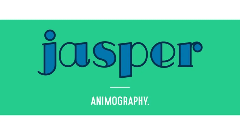
If you need an elegant animated serif typeface and don’t want to spend a day building a character rig, Animography Jasper is the most practical starting point in the Animography catalog. Jasper is based on Bodoni proportions: high contrast between thick and thin strokes, vertical stress, and the kind of geometry that reads well in title sequences, fashion content, and editorial motion graphics.
What separates it from a static font with animations bolted on is that each character has its own pre-built animation, and those animations are designed to flow correctly when characters are placed in sequence. You control timing, color, and line width without touching expressions. The workflow is: type your text, arrange your characters using the Animography Controller null, adjust parameters, render. On a standard 4K comp in After Effects 2024, expect previews to run at moderate speed , it’s shape-layer-based, so complexity scales with word count.
The honest limitation is that the character set covers standard Latin alphabet and numbers. If your project needs diacritics or extended Unicode support, you’ll hit a wall quickly. Also, as a pay-what-you-want product, the pricing is accessible, but the style is very specific , Bodoni-influenced serifs won’t fit every brand.
Key features:
- Bodoni-inspired letterforms with customizable line widths
- Per-character color control
- Designed to work with the Animography Controller
- Pay-what-you-want pricing (suggested $5.99)
- Compatible with After Effects CC 2019 and later
Pros/Cons:
- Pros: Immediately usable, no expression knowledge needed, elegant aesthetic
- Cons: Latin-only character set, style won’t suit every project, shape-layer complexity can slow previews on large comps
Best for: Motion designers who need a ready-to-animate serif typeface for titles, openers, or fashion content.
Pricing: Freemium , pay-what-you-want, suggested $5.99
2. TypeMonkey
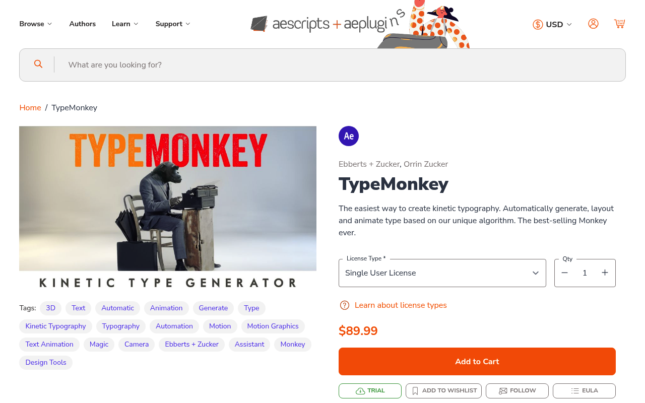
Typing out kinetic text layouts by hand , sizing words, placing them in comp, staggering timing, applying cameras , takes a long time for what is fundamentally a repetitive construction task. TypeMonkey automates it. You paste your text, set your parameters (font, size range, camera moves, timing density), and it builds the layout using markers on an audio layer or a guide track. The output is a fully keyframed kinetic typography composition that would take several hours to build manually.
The TypeMonkey approach is best understood as a layout generator, not a typeface. You bring your own fonts. It handles the spatial arrangement, timing, and camera moves. The marker-based timing system means you can sync word hits to audio peaks without doing it frame by frame. This is particularly valuable for lyric videos, promotional spots, or any brief where the text volume is high and the deadline is short.
The main constraint is creative control after generation. The builds are heavily expression-driven and can be tricky to modify at the individual word level once the script has run. If a client wants to change one word’s position or timing after the fact, you’re digging into an expression-heavy comp structure. Plan your text carefully before running it.
Key features:
- Automated kinetic text layout from pasted copy
- Marker-based timing system for audio sync
- Randomized sizing, rotation, and placement within set parameters
- Camera animation built into the output
- Works with any installed font
Pros/Cons:
- Pros: Dramatic time savings on high-volume kinetic text, works with any font, audio-sync capable
- Cons: Post-generation editing is complex, less useful for precise single-sentence compositions
Best for: Motion designers building lyric videos, promotional text-heavy spots, or rapid-turnaround kinetic layouts.
Pricing: Freemium , pay-what-you-want
3. Write-On Animated Typefaces
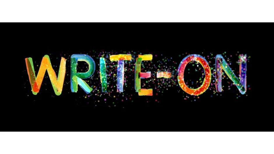
Write-on text reveals , where letterforms appear as if drawn by hand using a stroke , look clean and intentional, but building them manually means drawing masks, adjusting trim paths, and babysitting timing for every character. This plugin handles that automatically using expressions rather than manual keyframing.
Write-On Animated Typefaces ships with a set of purpose-built typefaces where every glyph has correct stroke order and path data embedded for expression-driven reveals. You type your text, the plugin generates the reveal animation, and characters appear in the right drawing sequence. There’s no pen tool work involved on your end. The expression-driven approach means the animation scales with text changes , update the copy and the reveal recalculates.
Compatibility note: this requires After Effects CC 2019 or later and works best when GPU acceleration is enabled. On older machines with integrated graphics, rendering complex multi-line reveals can be noticeably slow. The included typefaces are functional but limited in variety , you’re working with the fonts the developer designed specifically for the stroke-path system. You cannot apply the write-on system to arbitrary installed fonts without significant additional work.
Key features:
- Expression-driven write-on reveals without pen tool work
- Correct stroke order per character
- Animation updates automatically when text is changed
- No manual trim path keyframing required
- Paid plugin with free trial available
Pros/Cons:
- Pros: Saves substantial manual work, expression-driven means text is still editable, clean output
- Cons: Limited to included typefaces, cannot apply to arbitrary fonts, slow on integrated graphics
Best for: Designers who regularly build write-on title animations and want an automated solution that doesn’t break when copy changes.
Pricing: Paid , $34.99 (one-time purchase, free trial available)
4. Wandeln
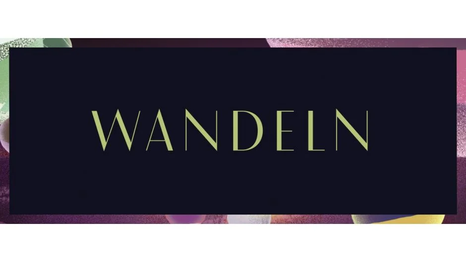
Wandeln occupies a specific visual territory: art deco geometry with animated reveals built around flowing curves and precise construction lines. The name is German for “to change” or “to wander,” and the letterforms reflect that , geometric segments reveal and connect in a way that references 1920s display typography without feeling like pastiche.
For motion designers working in luxury, architecture, heritage brands, or any brief that calls for decorative geometric type, Wandeln has a clarity of aesthetic that’s difficult to replicate with standard text animators. The animated version includes the full reveal and exit animations. The static version is a conventional font file you can use outside After Effects.
Like all Animography typefaces, the character set is Latin-focused. Performance on large comps is manageable but not lightweight , Wandeln’s letterforms involve multiple path segments per character, and complex headlines with many characters will increase your shape layer count significantly. Factor that in if you’re working with lengthy text strings on a project with other heavy effects stacked.
Key features:
- Art deco letterforms with geometric reveal animation
- Includes both animated After Effects version and static font file
- Customizable animation timing
- Pay-what-you-want pricing (suggested $35 for animated version)
- Compatible with After Effects CC 2019+
Pros/Cons:
- Pros: Highly distinctive aesthetic, static font included, strong for luxury and editorial work
- Cons: High shape-layer count on long text strings, very specific visual style
Best for: Designers working on luxury brand, architecture, or heritage content that needs decorative animated display type.
Pricing: Freemium , pay-what-you-want, suggested $35 for animated version
5. GoType
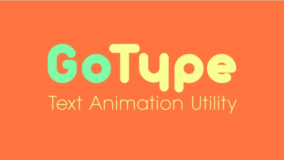
GoType is a compact animation utility rather than a typeface. The problem it solves: After Effects’ native text animators require multiple range selector configurations to get clean per-word or per-character kinetic motion, and the interface is genuinely awkward for quickly iterating on timing. GoType provides a minimal, focused panel for building kinetic text animations from your existing text layers without that friction.
You select a text layer, choose your animation type (character, word, or line-based), set your timing parameters, and GoType generates the animation. It works with any installed font, which makes it more broadly applicable than typeface-specific tools. The output uses After Effects’ native text animator system, so the resulting comps are clean and don’t add significant overhead.
GoType is particularly useful for motion designers who do high volumes of text work but don’t want the complexity of TypeMonkey’s full layout system. It sits in a practical middle ground , faster than doing it manually, less opinionated than a full automated layout tool. At $20 one-time, it’s one of the more straightforward value propositions on this list.
Limitation: it doesn’t add camera moves or spatial layout automation. It animates existing text layers. If you need a full kinetic composition built from scratch, pair it with a layout tool.
Key features:
- Compact panel for building kinetic text animations
- Works with any installed font
- Character, word, and line animation modes
- Outputs native After Effects text animators
- Trial version available
Pros/Cons:
- Pros: Works with any font, clean native output, low price, fast to learn
- Cons: No spatial layout or camera automation, less feature depth than larger tools
Best for: Motion designers who want faster text animation without a steep learning curve or opinionated layout system.
Pricing: Paid , $20 (one-time purchase, trial available)
6. TextDelay
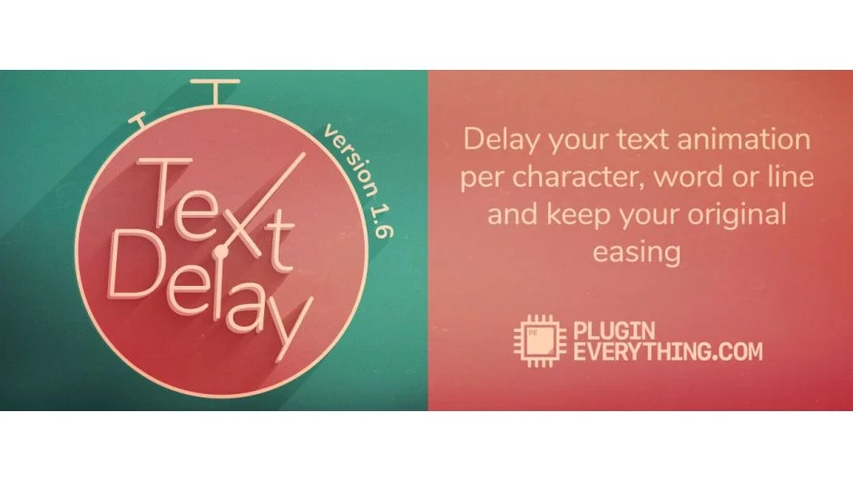
Staggered text animations , where characters, words, or lines animate in offset from each other , are foundational to kinetic typography. After Effects can do this natively, but the workflow involves manually setting range selector offsets and the easing on each selector is separate from your keyframe easing, which creates inconsistency. TextDelay solves this by applying delay directly to text layers and inheriting the easing from your existing keyframes.
The practical result is that you animate the text layer once with the easing you want, then TextDelay applies that exact motion , with the same curve , across characters, words, or lines with a delay offset you set. You get consistent, physically coherent stagger without fighting range selectors or reconfiguring easing on each element individually.
At $19.95 with a free trial, it’s a utility that pays for itself the first time you have 30 words to animate with matching easing across all of them. Compatibility is AE CC 2019 through 2025. One honest note: TextDelay works on 2D text properties and doesn’t account for 3D per-character space, so if you’re doing heavy 3D kinetic work, you’ll need to handle depth separately.
Key features:
- Delay by character, word, or line
- Inherits easing from existing keyframes for consistency
- Works with After Effects’ native text layers
- Compatible with AE CC 2019 through 2025
- Free trial available
Pros/Cons:
- Pros: Solves a genuine workflow pain point, inherited easing is a real differentiator, quick to implement
- Cons: 2D focus, doesn’t handle per-character 3D depth
Best for: Any motion designer who regularly builds staggered text animations and wants consistent easing across every element without manual range selector setup.
Pricing: Paid , $19.95 (one-time purchase, free trial available)
7. Discotext
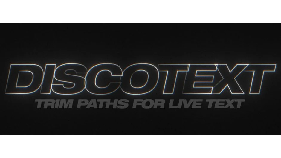
Trim path reveals on text , where letterforms draw on using a stroke , normally require converting text to shape layers first, which immediately breaks live editability. Every time the copy changes, you’re re-converting and re-rigging. Discotext solves this by applying trim path controls to live text layers directly, without the convert-to-shapes step.
Discotext uses shape layer logic to apply stroke outlines to your text while the text layer remains editable. You keyframe the end percentage of the stroke reveal and the characters draw on in sequence. The key workflow advantage is that the text stays live , you can change copy, font, size, and the stroke reveal system updates. On broadcast projects where copy changes happen late in production, this is a meaningful time saver.
Compatibility covers 8, 16, and 32bpc color depth, which matters for HDR pipelines. The $39.95 price point is reasonable for what it does, and a free trial is available. One limitation: complex serif typefaces with intricate stroke paths can produce reveals that look slightly mechanical at the join points. Clean sans-serif and geometric typefaces show the best results.
Key features:
- Trim path reveals on live, editable text layers
- No convert-to-shapes required
- Supports 8, 16, and 32bpc
- End-percentage keyframing for reveal control
- Free trial available
Pros/Cons:
- Pros: Maintains live text editability, clean output on geometric typefaces, broadcast-depth color support
- Cons: Complex serifs can show mechanical joins, learning the setup takes a session or two
Best for: Broadcast motion designers who need stroke-reveal text animations that survive late copy changes.
Pricing: Paid , $39.95 (single user license, free trial available)
8. Fat Frank
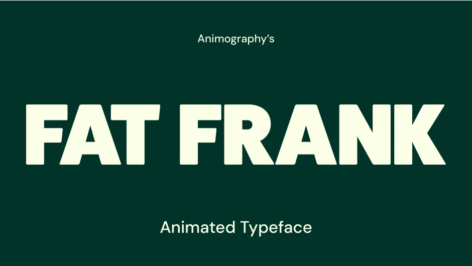
Fat Frank is built for projects that need weight and visual impact. The letterforms are thick, display-oriented, and the built-in animations lean into that mass , bounce, overshoot, and bold kinetic movement rather than elegant reveals. This is the right choice when the brief is energetic: sports, gaming, youth brands, promotional content where understated doesn’t serve the work.
Like other Animography typefaces, Fat Frank ships with per-character animations and is controlled via the Animography Controller null. Stroke width and color are adjustable. The pay-what-you-want pricing makes it accessible for freelancers testing whether the aesthetic fits their client roster before committing to heavier investment.
Performance is similar to other shape-layer-based typefaces in the Animography catalog: manageable on short text strings, increasingly heavy as word count grows. If you’re building a full paragraph of animated Fat Frank on a 4K comp with other effects active, expect slower previews. Use RAM preview strategically and prerender where you can. Also worth noting: the style is very specific, which is both its strength and its constraint.
Key features:
- Bold display typeface with kinetic character animations
- Customizable stroke width and color
- Designed for use with Animography Controller
- Pay-what-you-want pricing with free trial
- Works with After Effects CC 2019+
Pros/Cons:
- Pros: High visual impact, accessible pricing, works immediately without setup
- Cons: Narrow aesthetic range, shape-layer count increases with text length
Best for: Sports, gaming, and promotional motion graphics that need bold kinetic type with built-in impact.
Pricing: Freemium , pay-what-you-want (minimum not specified, free trial available)
9. Radiate
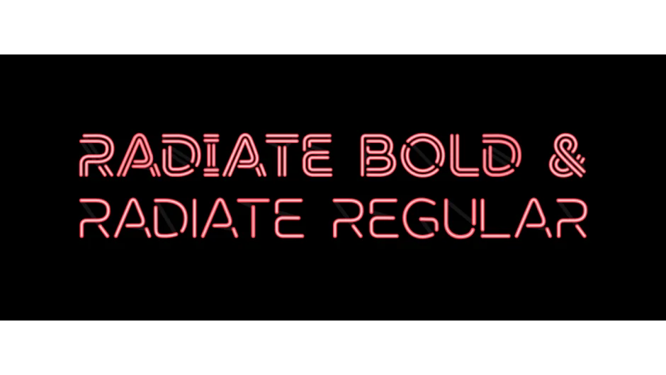
Radiate is a neon-style animated typeface with per-character animations that include glow effects, flicker timing, and line-on reveals. The visual language is clearly neon signage, but it’s executed with enough control parameters that it doesn’t feel locked into one era. Adjust the glow intensity, flicker behavior, and color to push it toward retro, cyberpunk, or contemporary digital aesthetics.
Where Radiate earns its place on this list is the specificity of what it does well: lighted text animation with physically plausible behavior is genuinely time-consuming to fake from scratch in After Effects. The flicker timing, glow falloff, and line-on sequencing are already built in and designed to look correct together. A motion designer building the same effect from native AE effects would spend considerably longer and likely get less consistent results.
The pay-what-you-want model means you can trial it before paying. Individual weights (Regular and Bold) are priced separately at the suggested level, so factor that in if your project requires both. As with all neon-aesthetic tools, the style has a defined shelf life , works exceptionally well for the right briefs, but has limited application outside them.
Key features:
- Animated neon typeface with glow, flicker, and line-on reveals
- Customizable glow intensity and flicker timing
- Available in Regular and Bold weights
- Pay-what-you-want pricing (individual weights start around $9.99 suggested)
- Compatible with After Effects CC 2019+
Pros/Cons:
- Pros: Physically plausible neon behavior built in, saves significant manual work for the right projects, accessible pricing
- Cons: Highly specific aesthetic, weights priced separately
Best for: Designers working on retro, cyberpunk, nightlife, or music video content that calls for animated neon typography.
Pricing: Freemium , pay-what-you-want, suggested from $9.99 per weight
How We Evaluated These Plugins
This list was built around one question: does this tool meaningfully change how you work with kinetic typography in After Effects, or does it just add a feature you could replicate manually in ten minutes?
Evaluation criteria, in rough order of importance:
Workflow impact: Does it solve a real bottleneck , stagger inconsistency, manual trim path rigging, layout automation, or lack of a specific visual style? Tools that address genuine friction ranked above ones that are useful but optional.
Compatibility: All tools on this list are confirmed compatible with After Effects CC 2019 through 2025 on macOS and Windows. Tools with known issues in current AE versions were excluded.
Text editability: For animation utilities, maintaining live text editability after the plugin runs matters significantly for broadcast and agency workflows where copy changes are routine.
Performance impact: Shape-layer-based typefaces add comp complexity. Where performance costs are meaningful, they’re noted in the individual entries.
Price-to-value ratio: Given the range from free to $39.95 on this list, every paid entry was assessed against what equivalent manual work would cost in time.
Update frequency and community: Tools with active development and documented support channels ranked above unmaintained scripts, even if the unmaintained tool technically still works.
What to Look for in Kinetic Typography and Animated Typeface Plugins
Before purchasing any text animation tool for After Effects, it’s worth being clear about which problem you’re actually trying to solve. The category splits into two distinct tool types with different trade-offs.
Animated typefaces (Jasper, Fat Frank, Radiate, Wandeln) give you a specific visual identity baked in. The benefit is that the aesthetic is consistent and production-ready. The constraint is that you’re working within the designer’s visual language. Ask yourself: does this typeface fit at least 30% of the projects I take on? If not, the investment may not recoup. Also check character set coverage , most Animography typefaces cover standard Latin plus numbers and common punctuation. Extended scripts, Arabic, or CJK require purpose-built tools.
Animation utilities (TypeMonkey, GoType, TextDelay, Discotext, Write-On Animated Typefaces) work with your existing fonts and solve specific workflow problems. These tend to have longer shelf lives in your toolkit because they’re not aesthetic-dependent. The trade-off is they require more setup knowledge and the output quality depends on your design decisions.
Compatibility and version requirements matter more than they used to. After Effects has changed significantly since 2019, and plugins built for CS6-era workflows may exhibit unexpected behavior in AE 2024 or 2025. Prioritize tools with confirmed compatibility notes for recent versions.
Live editability is the single most important technical feature for client-facing work. If changing the copy means rebuilding the animation from scratch, that’s a hidden time cost that erases the efficiency gain. For the text animation utilities on this list , particularly TextDelay and Discotext , live text editability is a core part of their value.
For projects requiring large-scale text versioning across multiple languages or markets, consider whether an animation utility can pair with a data-driven workflow. Tools that output native After Effects text animators (rather than baked shape layers) are significantly easier to integrate into template pipelines.
Frequently Asked Questions
What is the difference between an animated typeface plugin and a text animation plugin?
An animated typeface is a specific font with pre-built character animations included. You use it like a font , it has a fixed visual style and the motion is part of the design. A text animation plugin works with any font you already have installed and adds animation behavior (stagger, delay, trim paths) to your text layers. Both are useful; which you need depends on whether you need a specific visual style or a workflow tool.
Do After Effects kinetic typography plugins work with any font?
Animation utilities like TypeMonkey, GoType, and TextDelay work with any installed font. Animated typeface plugins like Jasper, Fat Frank, Radiate, and Wandeln only work with their own included letterforms , you cannot apply their built-in animations to arbitrary fonts.
Are these plugins compatible with After Effects 2025?
All tools on this list have confirmed compatibility with After Effects CC 2019 through current versions (2024/2025) as of this writing. Always check the developer’s aescripts product page for the latest compatibility notes before purchasing, as major AE updates occasionally break older scripts.
What is the best free option for kinetic typography in After Effects?
Among the tools on this list, most Animography typefaces use pay-what-you-want pricing where you can set your own price including $0 , making Jasper, Fat Frank, Radiate, and Wandeln accessible without upfront cost. TypeMonkey also uses pay-what-you-want. For a broader look at no-cost tools, the best free After Effects plugins collection covers tools across all categories.
Can I use animated typeface plugins in commercial projects?
Yes, with the caveat that you should review the specific license terms for each typeface. Animography typefaces are generally licensed for commercial use. Pay-what-you-want pricing for individual users typically covers commercial work, but business or team licenses at the suggested price are the expected contribution for commercial studio use.
How do I sync kinetic typography to music in After Effects?
TypeMonkey has built-in marker-based timing that syncs text hits to audio markers. For other tools, you’d use a beat detection plugin to place markers on your audio layer first, then use those markers to time your text animations manually. The Beat Assistant script is commonly used for this workflow.
What causes slow previews with animated typeface plugins?
Animated typefaces built from shape layers add a significant number of shape groups to your comp , each character can contain dozens of paths and groups. This compounds with text length, especially on 4K compositions. To improve preview performance, collapse your typeface precomps where possible, use Draft 3D mode during iteration, and avoid stacking multiple animated typeface layers in the same comp view simultaneously.
Is there a plugin that does both layout automation and animated typeface styling?
Not in a single tool on this list. TypeMonkey handles layout automation with any font you supply, while Animography typefaces provide pre-built character animations with fixed styling. For the most control, combine them: build your layout with TypeMonkey’s timing and camera system, then substitute your text layers with Animography character comps where the visual style fits.
Conclusion
For most kinetic typography workflows, the combination that covers the most ground is TextDelay for everyday text stagger work (it’s cheap, fast, and works with any font), Discotext for stroke-reveal projects where live editability matters, and one Animography typeface matched to your client base’s aesthetic. If you build high-volume text-heavy sequences regularly, TypeMonkey will pay for itself on the first project that would otherwise take a day to lay out manually.
For more tools in this space, the kinetic typography plugins collection and the animated typeface plugins collection cover additional options organized by use case.