What It Does
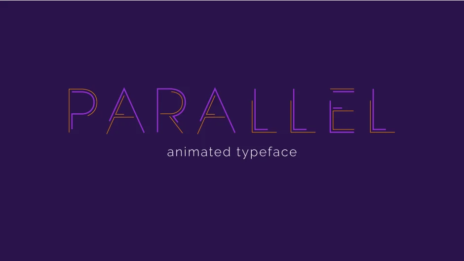
Parallel is an animated typeface built directly in After Effects with a dockable interface. Instead of static letters, it constructs characters from pairs of parallel lines you can style independently. Adjust line weight, color, and offset to create graphic typography that animates in with staggered timing. Zero out one line to create minimal single-line variants. The design stays legible even when pushed to extremes.
Key Features
Dual line styling. Each character uses two parallel lines. Control weight and color separately, or set one to zero for cleaner, minimal looks.
Offset control. Shift the lines apart for a looser, more experimental aesthetic.
Built-in animations. Letters animate in by default. Use the UI to set precise stagger timing per character. Time-reverse the layer to animate out without additional keyframing.
Maintained legibility. The typeface is designed to stay readable across all styling variations, useful when you need bold graphics that still communicate clearly.
Who It’s For
Useful for title animations, kinetic text work, and motion graphics where you need type that’s already designed to move. The parallel line construction gives a modern, technical look that works for tech explainers, data visualizations, and contemporary brand work.
Pricing
Parallel uses a pay-what-you-want model. You set the price when purchasing, starting from free. This makes it accessible for testing or small projects, with the option to pay more if it becomes a regular part of your toolkit.