What It Does
Responsive Tools adds adaptive layout capabilities to After Effects. Text layers automatically resize and reposition when you change composition dimensions or text content. Objects stay anchored to specific points, maintaining their relative positions as your design evolves. All this happens without creating extra layers or breaking your existing animation.
If you’ve ever had to manually readjust dozens of layers after a client requests a different aspect ratio, this addresses that.
Key Features
Four text adaptation modes. Comp mode adjusts text based on composition size. Layer mode responds to layer dimensions. Target mode locks to another layer’s bounds. Size mode scales based on text content changes. Each mode handles a different responsive scenario.
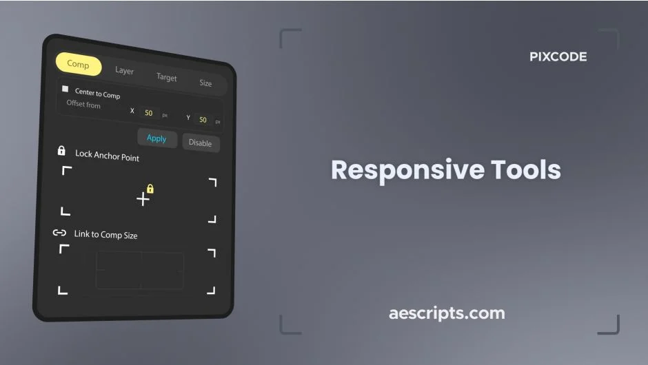
Anchor point locking. Pin the anchor point to any of nine positions (corners, edges, center) and it stays there when you transform the layer. Useful for maintaining alignment when scaling or adjusting layouts.
Layer positioning. Lock any layer to eight points around the composition edges. When the comp resizes, layers maintain their relative position, top left stays top left, bottom center stays bottom center, etc.
No extra layers. Everything works through expressions and controls on your existing layers. No proxy layers, no precomps you didn’t create.
Preserves animation. Existing keyframes remain intact. The responsive behavior layers on top of whatever animation you’ve already built.
Who It’s For
Motion designers working on templates or multi-format deliverables. Animators who need text that adjusts to different languages or content lengths. Anyone tired of rebuilding layouts when composition specs change mid-project.
Pricing
One-time purchase at $14.80. Compatible with After Effects CC 2019 through 2025. Trial version available.