What It Does
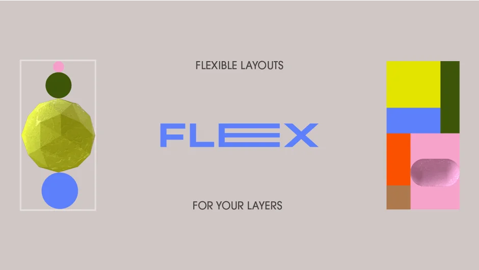
Flex rigs layers into responsive layouts where changing one layer’s size automatically adjusts its neighbors. You can build either single-line arrangements (rows or columns) or complex grid systems where rows and columns operate together. The tool uses expression-based controls to handle spacing, scaling, and alignment, similar to flexbox in web design.
Key Features
Line Rigs connect selected layers into straight rows or columns. Scale one layer, and its neighbors shift position to maintain consistent spacing. You control whether layers grow inward, outward, or from center.
Grid Rigs extend this to two dimensions. Set up horizontal and vertical controllers across your existing layout, letting you flex entire rows and columns at once. Useful for UI mockups, title cards, or any composition where multiple elements need to stay aligned while their content changes.
Flex Methods offer six scaling modes: layers can resize themselves, trigger adjacent layers, or both. You choose what happens when a layer grows.
Flex Mattes preserve your original layer dimensions by creating rigged mattes instead. Your artwork stays untouched while the responsive behavior applies to the matte layer.
Stroke Options let you specify whether shape layer strokes should be inside or outside the fill, which matters when you’re working with precise sizing.
The tool pairs well with Slides & Grids (same authors) if you want to generate the initial grid structure rather than rigging an existing layout.
Who It’s For
Motion designers building UI animations, kinetic typography, or any project where layer content changes but alignment must stay consistent. If you’ve ever manually repositioned a row of text layers after one word changed length, this solves that.
Pricing
Flex uses pay-what-you-want pricing. Name your price (the tool lists $25 as a reference point). Trial version disables Matte Mode and Stroke Options. Developed by Vincent Raineri and Zack Lovatt.